
Overview
Gigi is an AI-powered dating app that replaces the swipe-and-chat mechanic with an AI companion who analyzes behavior, handles initial conversations, and surfaces only high-quality matches. In 2024, I led the complete creative direction and product design — a full rebrand and product redesign from scratch, delivered in 6 months. At launch, Gigi reached #1 in France's App Store dating category, surpassing Tinder, Hinge, and Bumble in its launch window. D1 retention hit 65–70% against an industry benchmark of 25%. D30 retention reached 20% against a category benchmark of 7%.
Client
Gigi
Role
Principal Product Designer / Brand Strategist
Timeline
2024
Platform
AI · Mobile · iOS · Brand Identity · 0→1
A $6B market in structural tension
The dating app industry generated over $6 billion in 2024. Tinder held dominant market position globally. But the category was exhausted: users had optimized for volume of swipes, not quality of connections. The dominant UX pattern — photo, swipe, match, cold message — was generating low-quality conversations, high ghosting rates, and low emotional reward.
Gen Z was showing clear signals of fatigue. Research at the time showed 75% of dating app users frustrated with repetitive swiping and surface-level matching. This wasn't niche dissatisfaction — it was market-scale signal waiting for a credible alternative.
The arrival of consumer AI in 2023–2024 opened a genuinely new design space: for the first time, an app could plausibly make meaningful compatibility recommendations, not just serve an engagement-optimized algorithm.
Industry retention benchmarks (Business of Apps, 2024): D1 activation average: 25% · D30 retention average: 7%
AI is invisible. That's the design problem.
Gigi had an existing app and brand identity that wasn't resonating. The product needed to be repositioned and redesigned from scratch — new brand, new UX, new value proposition — to compete in a category dominated by companies with hundreds of millions in marketing spend.
The user problem: dating apps had optimized for volume, not connection quality. The UX was failing at facilitating the one thing users actually wanted.
The strategic design problem was harder: AI is invisible. You can't show a user that your AI understands them — you can only design interactions that produce that feeling. The core challenge was: how do you make a user believe in an AI companion's judgment within the first few minutes — before it has accumulated enough data to actually be accurate?
"Teaching AI to understand the complexity of human connection — that's not a technical problem. It's a design problem."
Sole design decision-maker across all tracks simultaneously
Title: Principal Product Designer / Brand Strategist
Duration: 6 months, 2024
Owned: Full brand identity and design system, complete UX/UI redesign from zero, marketing and communication assets for TikTok/Instagram launch, App Store listing design.
Collaborated with: Product team, AI/engineering team, growth and marketing leads.
I was the only designer on this project. The 6-month timeline was aggressive — brand and UX ran simultaneously, with marketing assets developed in real time as the product was still being built. Every design decision, from logo to onboarding screen to push notification copy, was mine.
Five decisions that drove the outcome
1. Rebrand as repositioning. The original app identity didn't match the AI-forward product needed. The rebrand wasn't cosmetic — it was strategic. The new visual identity had to communicate: playful but intelligent, warm without being soft, modern without being cold. Every element was coherent with the "AI bestie" personality — color, type, illustration, motion, and system copy voice.
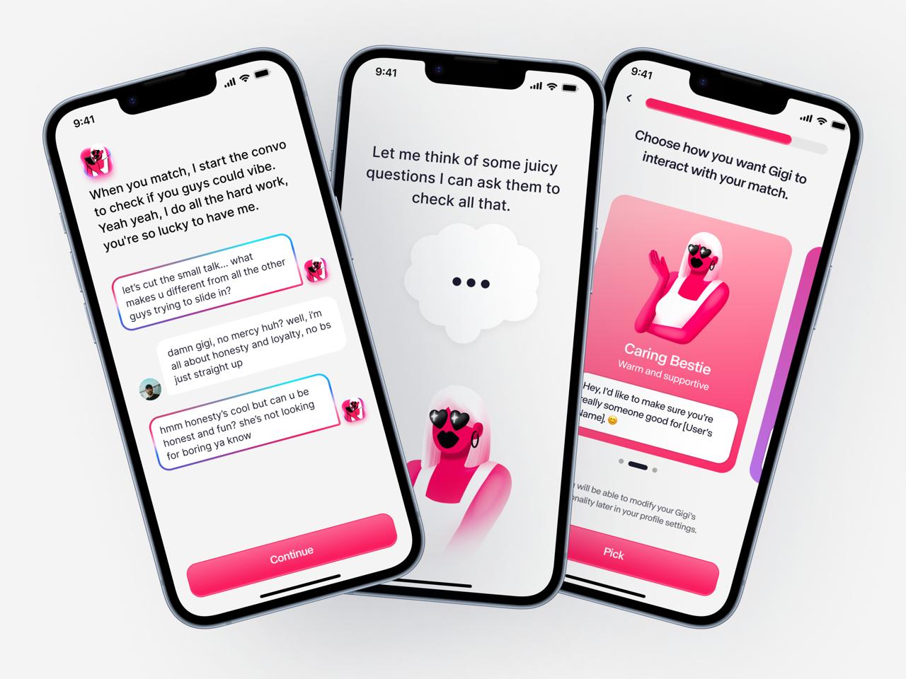
2. Front-loading the intelligence feeling. The AI's value is only credible if users feel it working immediately. I designed an extended but engaging setup sequence that felt like getting to know Gigi, not filling out a form. More data at setup = better early match quality = stronger first impression = higher D1 retention. This was a deliberate retention bet.
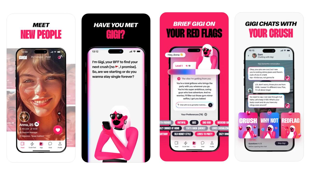
3. "Spy on the Convo" as a trust mechanic. Letting users observe the AI's conversations before deciding to engage was the most counterintuitive UX decision. Most apps hide the AI. Gigi surfaced it. Design logic: transparency builds trust. If users can see how their AI behaves on their behalf, they feel in control rather than replaced. It also increased session depth significantly.
4. Inbox architecture over swipe architecture. Replacing the swipe mechanic was a fundamental paradigm shift. Users have years of swipe muscle memory. The inbox model had to feel intuitively better within the first session. I solved this through visual hierarchy (AI ranking surfaced explicitly, not hidden) and through copy — every match card included a "why Gigi recommended this" signal that made the curation legible.
5. TikTok-native assets. The growth strategy was organic social. I designed marketing materials with TikTok UGC aesthetics — not polished brand advertising, but scroll-stopping content that looked genuinely user-made. This paid off: significant organic French TikTok traction drove the launch chart position.
A product that felt like a companion, not an app
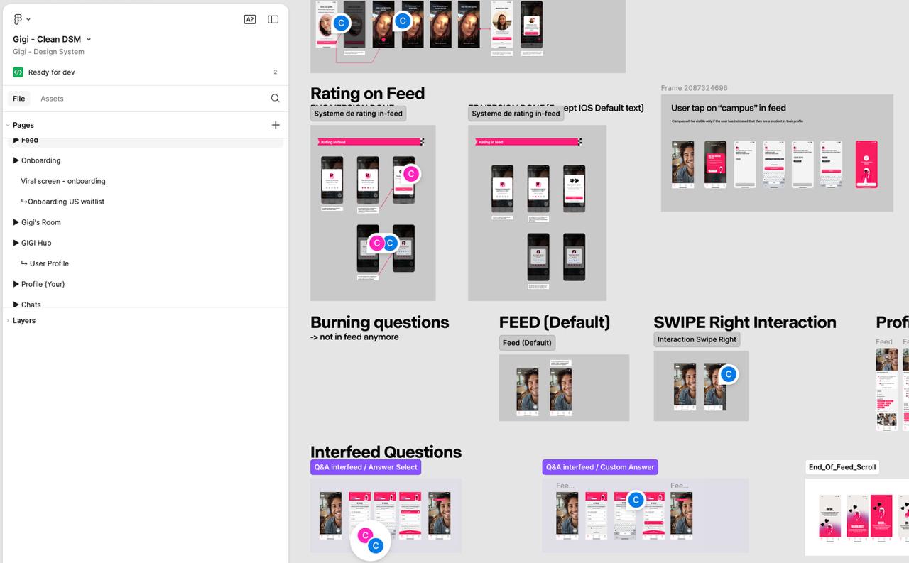
The redesigned Gigi launched on iOS in 2024 with: a full brand identity system (logo, color, type, illustration, motion), complete UX redesign across all flows (onboarding, AI setup, match discovery, inbox, Vibe Check, Spy on Convo), App Store listing and screenshots, and TikTok/Instagram campaign assets.
The product had a voice. Gigi — the AI character — maintained a consistent personality from system copy to push notifications to empty states. This is a level of UX craft most apps at this funding stage skip entirely. It was also one of the key drivers of the organic social sharing behavior that fueled launch growth.
Numbers that don't need qualification
Confirmed (internal app analytics):
- D1 retention: 65–70% · Industry average: 25% → 2.6–2.8× the benchmark
- D7 retention: 35–40% · Industry average: ~12%
- D30 retention: ~20% · Industry average: 7% → nearly 3× the benchmark
- App Store: #1 in France dating category at launch — above Tinder, Hinge, and Bumble
- US expansion: Gigi Campus initiative launched at multiple American universities
- App Store rating: 4.41/5 based on 190+ ratings
These aren't incremental improvements. At 65–70% D1 against a 25% category average, the first-session experience was working exactly as designed. At 3× D30 benchmark, the product was sustaining engagement well beyond the typical drop-off window. For a rebranded app in its first five months, those numbers are unusual by any standard.
Designing for AI is designing for trust, not features
Gigi clarified something important: designing for AI is fundamentally different from designing for features. Features are predictable. AI outputs are probabilistic. The UX has to build trust in a system that isn't perfectly consistent yet — and it must do so fast, before the first session ends.
The "Spy on Convo" mechanism was the most creative solution to that problem I've designed: make the AI legible and observable rather than hiding it behind a polished interface. That single decision elevated the product from "clever tech demo" to "something I actually trust."
What I'd do differently: invest earlier in instrumented A/B testing of the onboarding sequence. The setup length was a calculated bet — and it paid off — but it should have been a measured decision backed by split-test data, not instinct alone.
#1
France App Store (Dating)
Confirmed data
65–70%
D1 Retention Rate
Confirmed data
35–40%
D7 Retention Rate
Confirmed data
~20%
D30 Retention Rate
Confirmed data
2.6–2.8×
D1 Industry Benchmark
Inferred / directional
~3×
D30 Industry Benchmark
Inferred / directional
4.41/5
App Store Rating
Confirmed data
6 mo
Brand to Launch
Confirmed data
Press & Coverage

Next Project
TRYO
Multi-Brand AR Virtual Try-On Platform