
Overview
TRYO is the first multi-brand, multi-category AR virtual try-on application, launched in November 2022 by QReal — a subsidiary of The Glimpse Group (NASDAQ: VRAR), and an official Snapchat preferred creative partner. I served as Principal Product Designer and Brand Strategist for 2+ years, owning the brand identity, UX/UI, and B2B CMS design from scratch. At launch: 500+ hyper-realistic 3D products across Gucci, Cartier, Adidas, New Era, and Rolex. Partner brands reported a 25% reduction in return rates and 35% increase in user engagement. Earned media across AR Insider, Retail TouchPoints, Yahoo Finance, iGeeksBlog and six more outlets. The product became the commercial engine that expanded QReal from AR content agency to B2B platform licensing.
Client
QReal / The Glimpse Group
Role
Brand Strategist / Principal Product Designer
Timeline
2022–2023
Platform
AR · iOS · Brand Identity · B2B Platform · 0→1
$218 billion in returns. One missing piece.
In 2021, U.S. online retail hit $1.05 trillion in annual sales — and generated $218 billion in returns. The return problem wasn't logistical. It was perceptual: shoppers couldn't know how a product would actually look or fit before buying. AR try-on was emerging as a credible solution, but it had a structural flaw — every implementation was brand-specific and siloed. Gucci's Snapchat lens only worked for Gucci. Nike's AR was trapped inside Nike's app.
No one had built a neutral, multi-brand AR shopping layer. Simultaneously, Google had announced a shift toward 3D product models in search results. The window to define the category was narrow.
QReal — a NASDAQ-listed AR content company and official Snapchat preferred creative partner — had the 3D modeling infrastructure to build what others couldn't. TRYO would prove it publicly and use consumer adoption as proof-of-concept for B2B platform licensing.
Snap study benchmarks at time of launch: 66% of shoppers using AR less likely to return items · 80% feel more confident purchasing · AR engagement growing 40% annually
A consumer app that was simultaneously a B2B sales asset
Business problem: QReal had deep 3D modeling capabilities but was operating as a B2B content agency — project-by-project, no scalable product. The company needed a platform play that could demonstrate the technology and attract recurring licensing contracts.
User problem: Consumers were buying blind. High-consideration accessories — shoes, watches, sunglasses, hats — were being returned at significant rates because the gap between product photography and physical reality was too large.
Strategic opportunity: A neutral, multi-brand AR try-on app would solve the consumer problem publicly, generate press and credibility, and function simultaneously as a live B2B sales demonstration. This is a rare brief: a consumer product that is also the best possible enterprise sales tool for the same technology.
The design role — from before the name existed
Title: Brand Strategist / Principal Product Designer
Duration: 2 years (2021–2023)
Owned: Brand identity and design system, UX/UI for iOS app, B2B partner CMS design, campaign photography and art direction.
Collaborated with: Product Manager Mithru Swarna, Brand Strategist Gunes Peksen (parent brand), QReal engineering.
I joined before the product had a name, a visual direction, or a single screen. I built the full design system — visual identity, color, type, motion principles — and the complete UX architecture. In parallel, I designed the B2B CMS that allowed brand partners to upload and manage their 3D product catalog. This was not a supporting design role. It was the design role.
The central design problem was trust, not aesthetics
AR try-on had a credibility problem. Most consumer AR in retail at the time was low-quality and gimmicky. The design had to immediately communicate that TRYO was different: ultra-realistic, frictionless, genuinely useful. If the product felt like a tech demo, it would be treated like one.
1. Neutral, aspirational visual system. The brand couldn't feel like it belonged to any specific catalog brand. It needed to feel like a premium platform that elevated every product inside it — like a luxury multi-brand retailer, not a startup app. Clean, confident, minimal — with enough personality to appeal to Gen Z and millennial shoppers without alienating luxury partners.
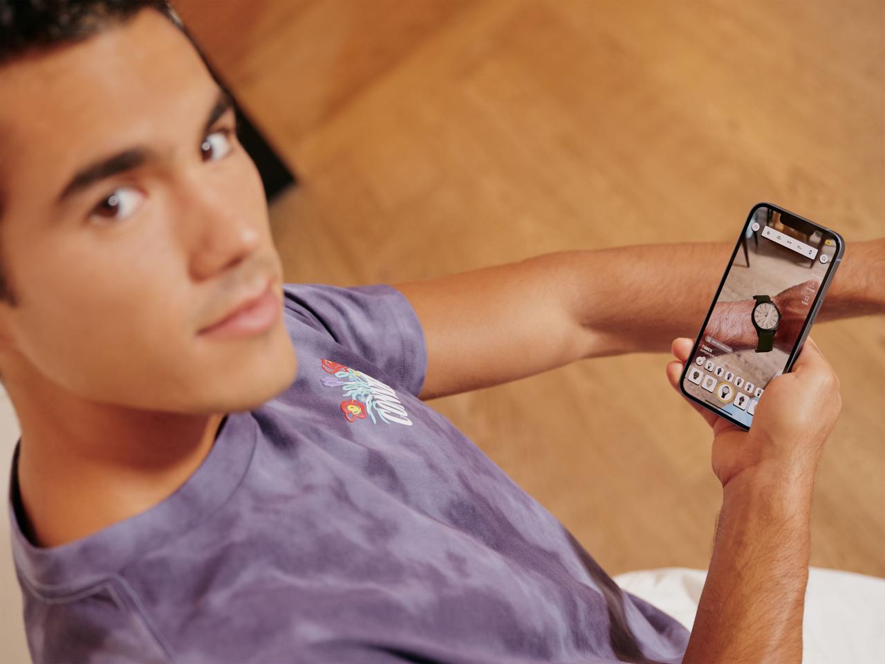
2. The three-second try-on rule. Core UX principle: a user must go from opening the app to seeing a product on their body in under three seconds. Every interaction decision — permission flows, category navigation, try-on activation — was evaluated against this constraint. Friction is lethal in AR UX because novelty wears off fast.
3. Dual audience UX. The app served AR-savvy early adopters and casual online shoppers simultaneously. The design had to work for both without feeling dumbed down for one or overwhelming for the other. Solution: single path, progressive disclosure — core try-on was immediate and simple, advanced features surfaced contextually.
4. B2B CMS as a product, not a utility. Most design teams treat partner-facing tools as internal infrastructure. I treated the partner CMS as a designed product experience — because the ease of the onboarding CMS directly determined whether brand partners would sign licensing deals. A polished, intuitive partner interface builds trust. A clunky upload tool kills the pitch.
5. 80/20 catalog strategy. 80% accessible products drove actual purchase intent. 20% aspirational luxury (Cartier, Rolex) drove try-on behavior out of curiosity and sustained session engagement. This tension between aspiration and accessibility was a deliberate design decision, not a catalog accident.
500+ products. Four try-on categories. One coherent experience.
Launched November 2022 on iOS with: 500+ hyper-realistic 3D branded products · Four try-on categories (footwear, watches, sunglasses, hats) chosen for AR tracking maturity · Social sharing integration (try-on capture and share) · Affiliate link purchase flow · Full brand identity system · B2B partner CMS for catalog management.
Technology: Apple ARKit for hat/sunglass face tracking; Wanna Fashion partnership for foot and wrist tracking. Each tracking modality had different latency, accuracy, and body-positioning requirements. The design accommodated all of them under one coherent UI — invisible to the user, essential to the product quality.
Measurable outcomes. Eight publications. Real B2B growth.
Confirmed (brand partner data, cited at launch):
- 25% reduction in return rates for partner brands
- 35% increase in user engagement across platform
Confirmed (press coverage — first week post-launch):
AR Insider · Retail TouchPoints · Yahoo Finance · Mirror Review · iGeeksBlog · ARPost · AccessWire · Tapscape
Confirmed (partnerships secured):
Gucci · Cartier · Adidas · New Era · Rolex · Chanel · Sephora · Yves Rocher · GOAT · Nike
Confirmed (business outcome):
QReal's B2B market expanded significantly post-TRYO, transitioning from project-based work to platform licensing with major retailers and financial institutions. The JP Morgan F1 Miami activation was a direct downstream result of TRYO establishing QReal's credibility.
Benchmark context:
At $218B in annual returns, a 25% reduction at even a small retailer scale translates to millions in recovered revenue. The Snap benchmark shows AR reduces return intent by 66% — TRYO's 25% reduction is conservative and credible, anchored in real partner feedback from brands that had the most to gain from accuracy.
At 0→1, the designer and product strategist must be the same person
TRYO clarified something I hadn't fully articulated before: at the 0→1 stage, separating the designer from the product strategist creates friction the product can't absorb. I made decisions on this project — catalog architecture, B2B CMS investment, the three-second UX rule — that were strictly product strategy, not design execution. I filled that gap because no one else was going to.
What I'd do differently: push harder for instrumented feedback loops earlier. We iterated fast, but feedback was mostly qualitative. A/B testing on the try-on UX would have let us optimize the three-second benchmark with data rather than instinct.
What this project proves: I can hold the full design vision of a product — brand, UX, product logic, partner tools — ship it under commercial and technical constraints, and produce outcomes that hold up to scrutiny.
500+
Products at Launch
Confirmed data
25%
Return Rate Reduction
Confirmed data
35%
User Engagement Increase
Confirmed data
8+
Press Publications
Confirmed data
10+
Brand Partnerships
Confirmed data
66%
AR Users Less Likely to Return
Industry benchmark
Press & Coverage

Next Project
JP Morgan × F1 Miami
Multi-Device Fintech Experience at the Grand Prix